Inclusive and accessible websites
Want to find out what goes into making a website accessible? There’s actually more going on behind the scenes than you think.
INTRODUCTION
First, let’s break down what we mean by an accessible website. It can be categorised into the following:
- Responsive design / device compliance
- Accessible design
- Provision for disabilities and impairments
INCLUSIVITY
Being accessible and socially inclusive means that anybody that wants to access your website should be able to do so, and the site should make provision for any requirements that they may have.
Access to technology is unfortunately not equal across all parts of the country, if your website was only accessible to users with a desktop computer for example, it would technically be excluding potential visitors than do not have access to one for financial reasons.
The vast majority of the UK now has access to a smartphone, this places greater responsibility and emphasis on responsive design and device compatibility than ever before.
RESPONSIVE DESIGN
Designing a site to be responsive is nothing new. Initially mobile devices only had access to a specifically developed version of sites via WAP (Wirelsss Access Protocol), however with the advent of smartphones and increased processing power, devices quickly became able to view the same websites as desktop computers.
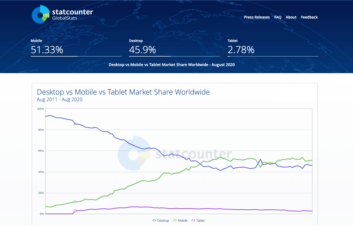
This initially involved lots of scrolling around and was quite cumbersome, however design quickly evolved to adapt to the device on which it’s being viewed. Mobile web browsing had been growing steadily since 2009, then in 2016 mobile website browsing actually overtook desktop devices for the first time. It was at this point that a website which wasn’t fully responsive would be considered archaic.

Fast forward to the present day; the expectation is now that any website should be visible and fully functional on all devices, including mobile phones, tablets, desktop computers and everything else in between.
Surprisingly, lots of websites still don’t work well or optimally on mobile devices. This is no longer an optional requirement but a basic step in modern frontend website development. A site should be able to adapt and reformat itself to be visible to anyone that needs to view it.
Modern frontend website development has the power to change from a horizontal to a vertical bias using CSS media queries or the new container queries to ensure that there’s enough space on the form factor to accommodate the content.
ACCESSIBLE DESIGN
So your website works on your phone, your Mac and every obscure web browser under the sun, that’s great – but what about the actual accessibility of the design itself?
In 2018 the Worldwide Web Consortium (W3C) defined the WCAG 2.1 guidelines to website accessibility. This is a rather lengthy document which encompasses many different design facets which can be an accessibility issue.
Briefly, In terms of website design, these guidelines cover the following:
- Use of colour
- Contrast
- Readability of text
- Spacing
- Use of images
You can read the full document online at: https://www.w3.org/TR/WCAG21/.
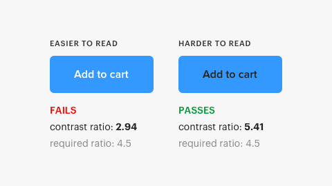
Content needs to be of a sufficient size, style and colour to be easily readable by all. There are different levels of WCAG compliance A, AA and AAA. If you’re unsure, there’s a great tool for checking accessibility at: https://accessibleweb.com/color-contrast-checker/. This will calculate the contrast ratio, readability, size and legibility of your text for all audiences and allocate a score against it. If your site features a soft grey colour text against a white background, then expect this to be flagged as an accessibility issue for people with visual impairments or poorer eyesight.
The issue of spacing overlaps with the responsive design section above to some extent. You need to ensure that buttons have a suitable level of padding and size to be clicked by people on mobile devices or touchscreens. Apple Human Interface Guidelines (https://developer.apple.com/design/human-interface-guidelines/ios/visual-design/adaptivity-and-layout/) recommend a 44 x 44pt minimum element size for clickable links. This is so they’re easily selected and not prone to accidental clicks on neighboring items. Remember, some peoples fingers are bigger than others!
Images have a number of pitfalls when it comes to accessible design. It’s not as common now, but we do still see people putting text in images. If this image doesn’t load for whatever reason, the text isn’t readable. In addition, if you want search engines to be able to read and digest the content, putting it in an image is certainly the last thing you want to do!
Images should:
- Contain a text alternative (ALT)
- Be scaled to be easily and quickly loaded on the device they’re being accessed (dimensions and file size)
- Be used for imagery and logos to accent textual content, not instead of it.

DISABILITIES AND IMPAIRMENTS
Do you assume that everyone visiting your site has perfect eyesight, dexterity, colour sensitivity and tolerance to movement? This is an obvious leading question, but you really shouldn’t.
Examples of how disabilities and impairments may affect how your website is accessed might include the following:
- Ability to differentiate colours (see WCAG guidelines above).
- Text should be readable for those with poorer eyesight.
- Be compatible with screen readers; these read the content of the website aloud to the visitor.
- Allow for navigation by keyboard where the user doesn’t navigate via a mouse or touch screen.
The site should be built in a descriptive and semantic fashion using HTML5 elements with correct use of headings to describe content. Screen readers and accessibility helpers rely on the website to provide them with cues to successfully guide a user with disabilities around your site. An example of this would be the correct use of ARIA tags to describe what the purpose of an element is, or a link to skip past navigation and straight to the content.
If the user needs to increase the size of the text in order to read it, they should be able to do so, it shouldn’t be locked to a specific pixel value which prevents this. Sometimes the text size that a designer deems to be suitable might not be the best and most universal choice for all users.
There’s a flag in most modern browsers that requests reduced motion, this is used by people who might feel sick from watching too many animations. There’s a flag called “prefers-reduced-motion” that websites can choose to respect which will ideally disable animations for such users. Again, this is outlined in the WCAG guidelines to ensure that people have a choice when accessing a website.
If your site has rich media, such as videos, is there a textual counterpart? For time-based media like video, captions mean that hearing impaired will still be able to get benefit from your site.
There’s not space here to cover the whole topic of impairments and accessibilities, this is very much a whistle-stop tour of the sort of considerations you need in order to have a fully accessible website.

CONCLUSION
Hopefully this article has made you think a bit about what else your website should be doing to be viewable and usable by all. There are a number of ways to approach this and every agency will have their preferences.
If a designer is well clued up on accessibility requirements, then a design can be created to make provision for many of these requirements from the outset, or at least avoid any obvious accessibility pitfalls. Often the reality is a collaborative approach which involves UX (User eXperiance) specialists or frontend developers. It may also be that there is a review stage to ensure guidelines are being adhered to.
Ultimately, regardless of how the team accomplishes this, the end result should be a website that’s well designed visually, degrades well with older devices and smaller screen sizes, and is readable and legible to all.
The goal of the inclusive internet is to ensure that groups are not excluded from sites and services. If you only have a mobile phone, you would still expect to be able to use eBay without investing in a desktop device?


